Engineering
Mar 5, 2026
Engineering
Writing Stories for 50 Components: Foundation, Automation, and AI

Seunghyun Lim
인턴
Mar 5, 2026
Engineering
Writing Stories for 50 Components: Foundation, Automation, and AI
Seunghyun Lim
인턴
During a three-month frontend internship at Lablup from December 2025 to February 2026, I wrote 'stories' for over 50 components in the Backend.AI WebUI. Rather than jumping straight into writing stories one by one, I first built guidelines and an automation pipeline, then wrote stories on top of that foundation with the help of AI. If I had to sum up this work in one line, it would be: build the foundation first, and understand what role humans play when using AI as a tool. This blog post shares the journey from setting up the Storybook infrastructure to deploying ui.backend.ai.
What Is Storybook?
Storybook is a tool for rendering and documenting UI components in an environment isolated from the app. As the name suggests, it is a tool for writing 'stories' for components, where a story is a single scene that visually represents a specific state of a component. For example, for a button component, 'default state,' 'disabled state,' and 'loading state' would each be a separate story.
Without reading any code, you can see "what a component looks like and what options it has" right in the browser. You can also toggle props in real time to instantly explore different states.
Why Was It Needed?
The Backend.AI WebUI has over 50 custom UI components prefixed with BAI. These are components shared across the team, such as BAIButton, BAICard, and BAIModal, but most of them had no usage documentation. If a new team member wanted to find out "how do I use BAICard?", they had to read the source code directly or launch the app and navigate to the screens where the component was used.
It was not that Storybook did not exist at all. There were instances in both react/ and packages/backend.ai-ui/, but the react/ instance had only one story, and the documentation coverage was low compared to the 50+ components.
Moreover, simply creating a large number of stories was not enough. Maintaining consistent quality across 50+ components required automation. If stories were created manually one by one, the writing style would vary from person to person, and it would be easy to forget to update stories when components changed. We needed a structure where guidelines set the standards, AI tools assist with generation, and CI automatically catches gaps.
How?
The work was divided into four phases.
Infrastructure Setup → Automation Tool Development → Component Story Writing → Deployment & Stabilization
Infrastructure Setup: Making Storybook Work "Properly"
You might think that installing Storybook and running npm run storybook would be all it takes, but for a complex app like Backend.AI WebUI, that was not the case. The global configurations that components depend on were missing in the Storybook environment.
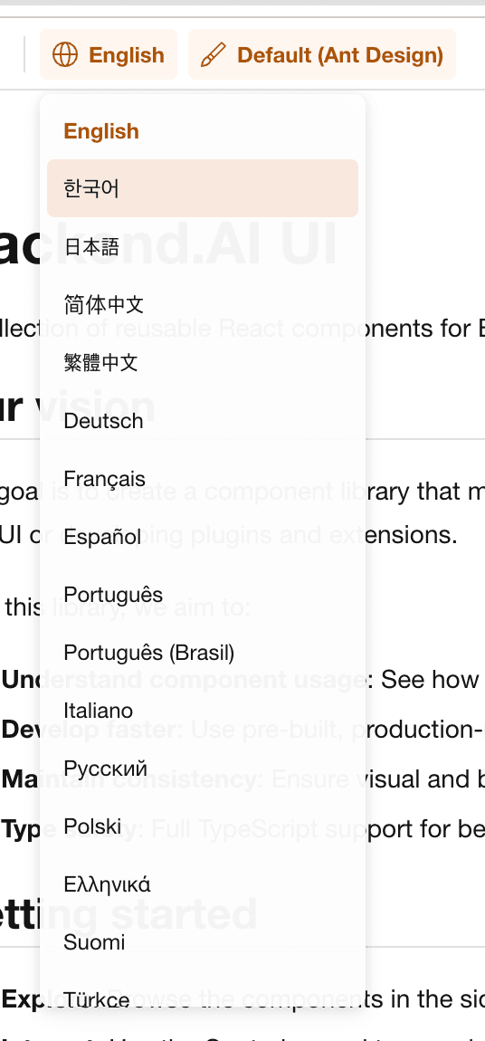
The first problem I encountered was internationalization (i18n) (#4946). Backend.AI WebUI is a multilingual app supporting 21 languages, with components fetching translated text through the useTranslation() hook. However, without i18n configured in Storybook, a "Create" button would display as the raw key string general.Create. I integrated i18next into the Storybook preview and added a locale selector dropdown to the toolbar so that all 21 languages could be freely switched and verified.
Next was Ant Design ConfigProvider integration (#5020). Backend.AI WebUI is built on Ant Design but applies its own styling through ConfigProvider, allowing different themes to be applied per customer. Without these settings in Storybook, components rendered differently from the actual app. we integrated these as a decorator and also added light/dark mode switching support.
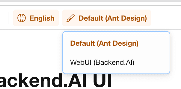
Theme switching was also needed (#5088). Backend.AI WebUI can apply different themes for different customers, so it was necessary to verify how a component looks under both the default Ant Design theme and the Backend.AI custom theme. I added a theme selection dropdown to the toolbar. In the screenshot below, the "Default (Ant Design)" label is this dropdown — you can switch between the default and custom themes with a single click to immediately compare how the same component differs across themes.
These three settings were bundled into a single Global Provider decorator that is automatically applied to all stories. No matter which component's story you open, the i18n, design settings, and theme are consistently applied.
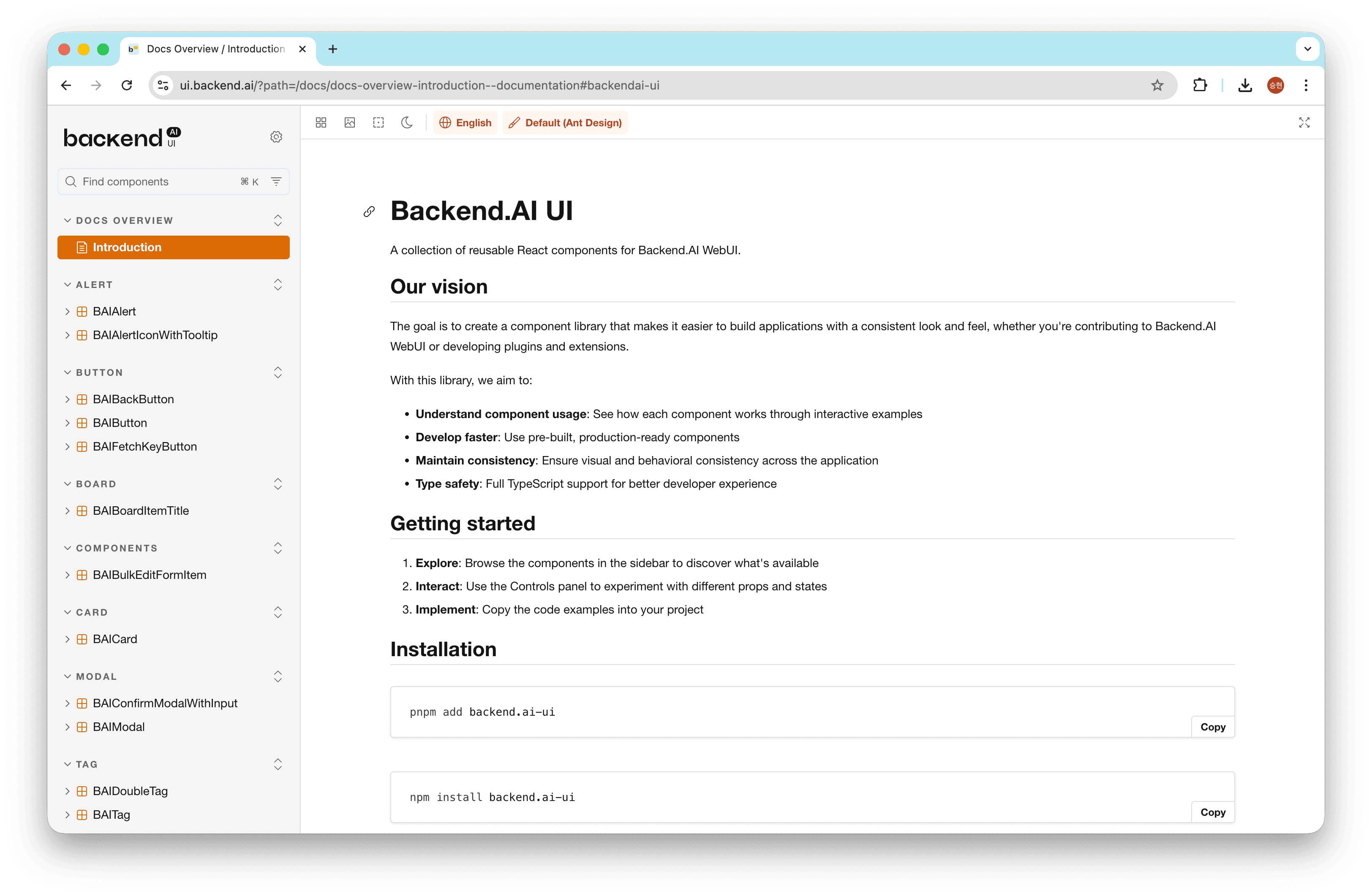
The default Storybook shows a white background with the Storybook logo, which felt like it lacked identity as an internal tool. I placed the Backend.AI UI logo at the top of the sidebar and applied the brand color orange (#FF7A00) as the primary color (#5040). I also replaced the favicon and created an Introduction page with a project overview.
The largest infrastructure task was the Storybook v10 upgrade and instance consolidation. The monorepo had two Storybook instances, but the react/ one had only one story and 13 Storybook-related packages installed. I decided to consolidate the two instances into one while upgrading from v9 to v10.
However, the v10 upgrade turned out to be more complex than expected. Storybook 10 required tsconfig.json's moduleResolution to be set to bundler, and eslint-plugin-storybook 10.x only supported ESLint 9's flat config. A single Storybook upgrade cascaded into TypeScript configuration changes and an ESLint migration. There was quite a bit of trial and error, but after this work, all stories were consolidated into a single backend.ai-ui package, making management much easier.
Automation Tool Development: From PR to Deployment, Automatically
After the infrastructure was in place, I did not start writing stories right away. Creating stories for 50+ components by hand one by one was inefficient, and writing styles would inevitably vary from person to person. I chose a strategy of first building automation tools and standards, then writing stories on top of them. The automation tool development began with actively leveraging PRs (Pull Requests) — submit code changes for review, team members review the code, and if there are no issues, merge it.
The final pipeline I designed looked like this:
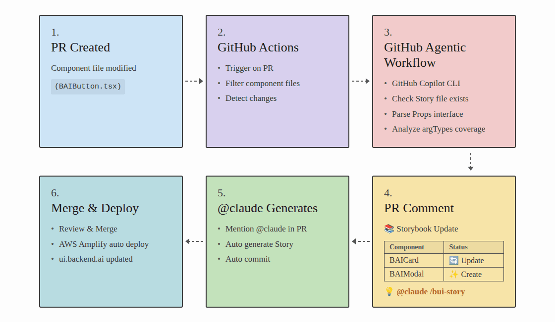
Step 1: PR Creation — A developer modifies a component file (e.g., BAIButton.tsx) and creates a PR. Up to this point, it is the same development workflow as usual.
Step 2: Auto Detection — When a PR is created, the automated CI system (GitHub Actions) is triggered. It filters the changed file list for BAI component files and detects which components were modified.
Step 3: Analysis — This is the analysis step using GitHub Copilot CLI. It checks whether a story file exists for each changed component, parses the Props interface, and analyzes the story's argTypes coverage. It automatically checks whether newly added props are reflected in the story and whether any prop types have changed.
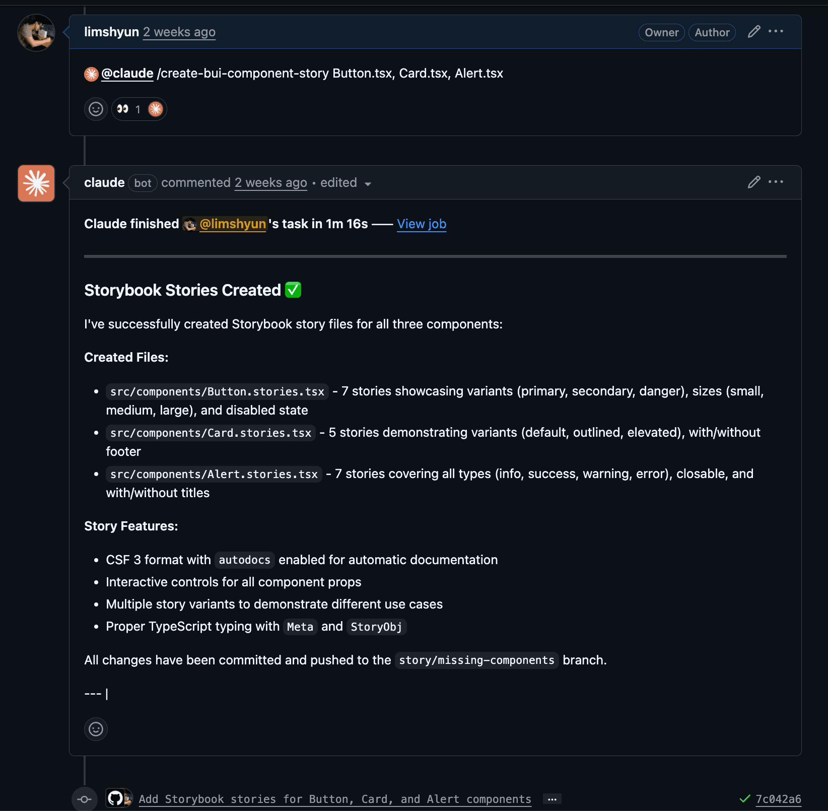
Step 4: Report — The analysis results are automatically posted as a PR comment. It shows in a table which components need new stories (Create) and which stories need updates (Update). At the bottom of the comment, the @claude /bui-component.stories.tsx command is provided so you can proceed directly to the next step.
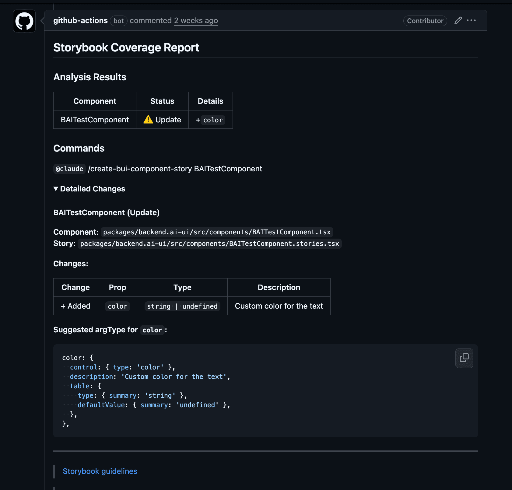
Step 5: AI Generates Stories — When @claude is mentioned in the PR, Claude references the guidelines, automatically generates stories, and commits them directly. It maps appropriate Storybook controls based on prop types — checkboxes for booleans, select dropdowns for union types, text inputs for strings, and so on.
Step 6: Deployment — After review, once merged, AWS Amplify automatically builds and deploys to ui.backend.ai.
The key to this pipeline is that code reviewers never need to ask "Did you update the stories?" — the system detects, AI generates, and deployment happens automatically. Developers just modify the component and the pipeline handles the rest.
Let me introduce the tools I built to set up this pipeline.
Teaching AI the Standards First: A 1,000-Line Guideline
This is the reference document that all automation in the pipeline relies on (#4958). I created a comprehensive guideline of over 1,000 lines that establishes CSF (Component Story Format) 3 as the default format, covering Meta configuration, 6 story definition patterns, anti-patterns, and checklists.
Why was such a detailed document necessary? Simply telling AI to "create a story" does not produce usable results. Without context, it mixes Storybook 7 and 8 syntax, omits argTypes, or generates code completely unaware of our project's Relay Fragment patterns.
This is true in any tool domain — for AI to produce usable results, humans must first define the criteria for "good results." You need to collect the best examples, analyze why AI got it wrong, and iteratively widen the degrees of freedom from there. The 1,000-line volume is not showing off — it is the product of that iteration.
There is a reason I placed this guideline at .github/instructions/storybook.instructions.md. GitHub Copilot's Custom Instructions feature automatically references instruction files that match specific file patterns. By configuring it to apply to *.stories.tsx files, Copilot automatically references our conventions when team members edit stories and suggests code accordingly.
AI-Powered Automatic Story Generation
This is the tool used in Step 5 of the pipeline (#4959). I created a slash command called /manage-bui-component-story in Claude Code, which, given a component file path as an argument, has Claude analyze the guidelines and props interface to automatically generate a story file in CSF 3 format.
It did not work well from the start. Initially, the stories Claude generated often mapped prop types incorrectly or added unnecessary decorators. Each time, I analyzed "why it was wrong" and fed that back into the guidelines. The anti-patterns section is a prime example — it is a list accumulated by collecting the actual mistakes Claude made one by one. If you skip this process, even with an automation tool, humans end up having to fix the output from scratch every time.
Later, I extended it twice, adding a batch mode for processing multiple components at once, and an UPDATE mode for comparing existing stories against current props and updating them.
GitHub Actions: Catching Gaps with CI
This handles Steps 2–4 of the pipeline. It performs two checks sequentially.
The first is the story existence check. When a PR transitions to ready_for_review, it checks whether a corresponding story file exists for each changed component file. If not, it posts the missing list as a PR comment, and when a story is added, it automatically deletes the comment.
The second is the coverage checker. Even if a story file exists, it might only cover half of the props. It compares the component's Props interface with the story's argTypes and reports the differences. Added props are marked with +, removed props with -, changed prop types with ~, and for missing props, it even provides recommended argType snippets.
Component Story Writing: Different Approaches by Type
Once the automation tools were in place, I began writing stories in earnest. An important point here was that not all components could be handled the same way. They fell into three broad types based on data dependencies, and the difficulty and approach differed completely by type.
Basic Components — These are components like BAIButton, BAIModal, and BAICard that work just by passing props (#5005, #5007). Once argTypes are defined, you can directly manipulate and explore props through Storybook's Controls panel. "Basic" does not mean simple. BAIButton has async action handling and double-click prevention, so the story needed to show the click → loading → complete flow, and BAIResourceNumberWithIcon had to represent icons for all 14 resource types including NVIDIA GPU, AMD GPU, and TPU.
Utility Components — These are components like BAIIntervalView and BAIUncontrolledInput that have internal state or timer logic. Simply passing props is not enough to demonstrate their behavior, so React hooks need to be combined within the render function.
Here is a real debugging story: BAIIntervalView is a component that re-renders its children at a specified interval. When I tried to show "how many refreshes have occurred" in the story by managing a counter with useState, the browser froze completely. Every interval tick updated the state, the state update triggered a re-render, and the re-render re-registered the interval — an infinite loop. I fixed it by switching to useRef so it would not trigger re-renders, but at first it took a long time just to figure out what was wrong.
Relay Fragment Components — This was the trickiest type (#5024, #5011). Backend.AI WebUI uses GraphQL (Relay) for data fetching. Relay's Fragment pattern has each component declare the data it needs as a GraphQL fragment and receive that data from its parent. The problem is that in Storybook, there is no actual GraphQL API server. Without a parent to provide data or a server to query, the component simply cannot render.
To solve this, I applied the RelayResolver + MockPayloadGenerator pattern. This structure defines Storybook-specific GraphQL queries and responds with mock data in a fake Relay environment.
I started with simple ones like tag and badge components, but hit the hardest problem with modal/button components. Modals fetch data with a query when opened and modify data with a mutation when the confirm button is clicked. However, the existing RelayResolver could only handle one GraphQL operation. I applied a recursive resolver pattern to handle unlimited operations, and this pattern was reused for stories of other components that include mutations.
There were unexpected wins along the way. While writing stories for select/query components, I discovered and removed unnecessary passthrough wrapper components, and for table components, I learned that Relay's Global ID needs to be generated with btoa(). Some of these issues surfaced from stories that Claude generated based on the guidelines — working within structured standards brought to light things that humans had overlooked. The process of writing stories itself became an opportunity to deeply understand and improve the code.
Deployment & Stabilization: Why It Works Locally but Breaks in Production
The stories were deployed to ui.backend.ai. Issues surfaced in three components. BAIFetchKeyButton broke because the dayjs relativeTime plugin was missing, breaking relative time display. BAIAdminResourceGroupSelect broke because the mock resolver's GraphQL type names did not match the actual schema, causing dropdown items to merge into one. BAILink broke because theme fonts were not applied. All three problems shared the same root cause: Storybook does not share the app's runtime environment.
As the number of stories exceeded 50, sidebar organization became necessary too. I simplified the three-level hierarchy like Components/Button/BAIButton to two levels like Button/BAIButton, and added an Icons overview story where all BAI icons can be searched on a single screen.
Summary
Here is a summary of the three months of work:
- Infrastructure: i18n, ConfigProvider, branding, theme toolbar, v10 upgrade, instance consolidation
- Automation: 1,000-line guideline, Claude slash command, story existence check CI, coverage checker CI
- Stories: 15 basic components, 7 utility components, 27 Relay Fragment components
- Deployment & Stabilization: ui.backend.ai deployment, sidebar structure reorganization, existing story documentation improvements
Out of 22 total PRs, 17 have been merged and 4 are in review.
Looking back, the best decision was building the infrastructure and automation first. If I had written stories without guidelines, the format would have varied from person to person, and without CI checks, humans would have had to manually verify every prop coverage gap. I believe the 10 infrastructure/automation PRs laid the foundation that determined the quality and speed of the subsequent 12 story/deployment PRs.
Two Lasting Takeaways
Before this work, BAI components had no screen where developers could directly see them visually. To know what a component looked like, you had to read the source code or launch the app and navigate to the page where the component was used. Now, by visiting ui.backend.ai, all components can be explored right in the browser. But there are two lessons more important than simply "being able to see them."
First, foundation comes first. BAI components are building blocks shared across multiple screens. Without standards, using them ad hoc leads to accumulated inconsistencies where the same button behaves differently on different screens. Storybook is the answer to this problem. When you visually define which props each component supports and which states are possible, that definition becomes the component's standard. There was a temptation to create as many stories as possible first, but it was only after establishing guidelines and automation that I could create 50+ stories with consistent quality.
Second, the human role changes when working with AI. It is easy to command "create a story." But for AI to produce usable results, humans must first define the criteria for good results. The 1,000-line guideline was not written all at once — it is the product of observing AI's failures, analyzing the causes, and iteratively updating. Just as humans look at stories to use components consistently, AI also looks at the guideline at .github/instructions/storybook.instructions.md to generate consistent stories. The fact that the standards for humans (Storybook) and the standards for AI (guideline) start from the same place is the reason this pipeline actually works. The work of writing code decreases, while the work of defining and updating standards increases. Using AI as a tool is ultimately about that.
The most meaningful thing about this internship was not that I created many stories, but that I built "a foundation where everyone can look at the same thing and talk about it" for the components. And "everyone" now includes AI.
All PRs mentioned in this post can be found in the lablup/backend.ai-webui repository.